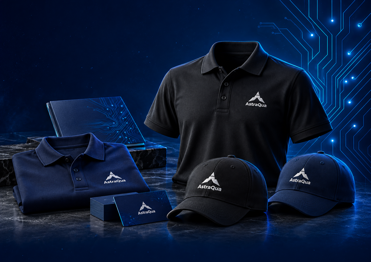
AstraQua, precision with a sense of possibility.
An identity exploration for a company developing AI for autonomous systems. The visual direction brings technical confidence and a spirit of exploration into a distinctive mark and wordmark.

The challenge
Give a technical venture a clear visual identity that balances precision and exploration. The design direction connects the AstraQua name with a sense of movement, without relying on a literal depiction of a particular product.
The approach
The letter A emerges through a detached apex and open centre. Balanced wings suggest direction and movement, bringing an exploratory character to a compact geometric symbol.
The mixed-case AstraQua wordmark gives the symbol a clear verbal counterpart. White, deep navy and black form a restrained presentation palette, keeping the identity legible against technical and conceptual imagery.
The identity in context
The presentation explores how the identity could appear across equipment, technical publishing and team apparel.
- Symbol and wordmarkA detached apex, open centre and winged lower form paired with the AstraQua name.
- Concept applicationsAI-generated application studies explore equipment and apparel. These are illustrative concepts, not photographs of manufactured products or evidence of deployment.