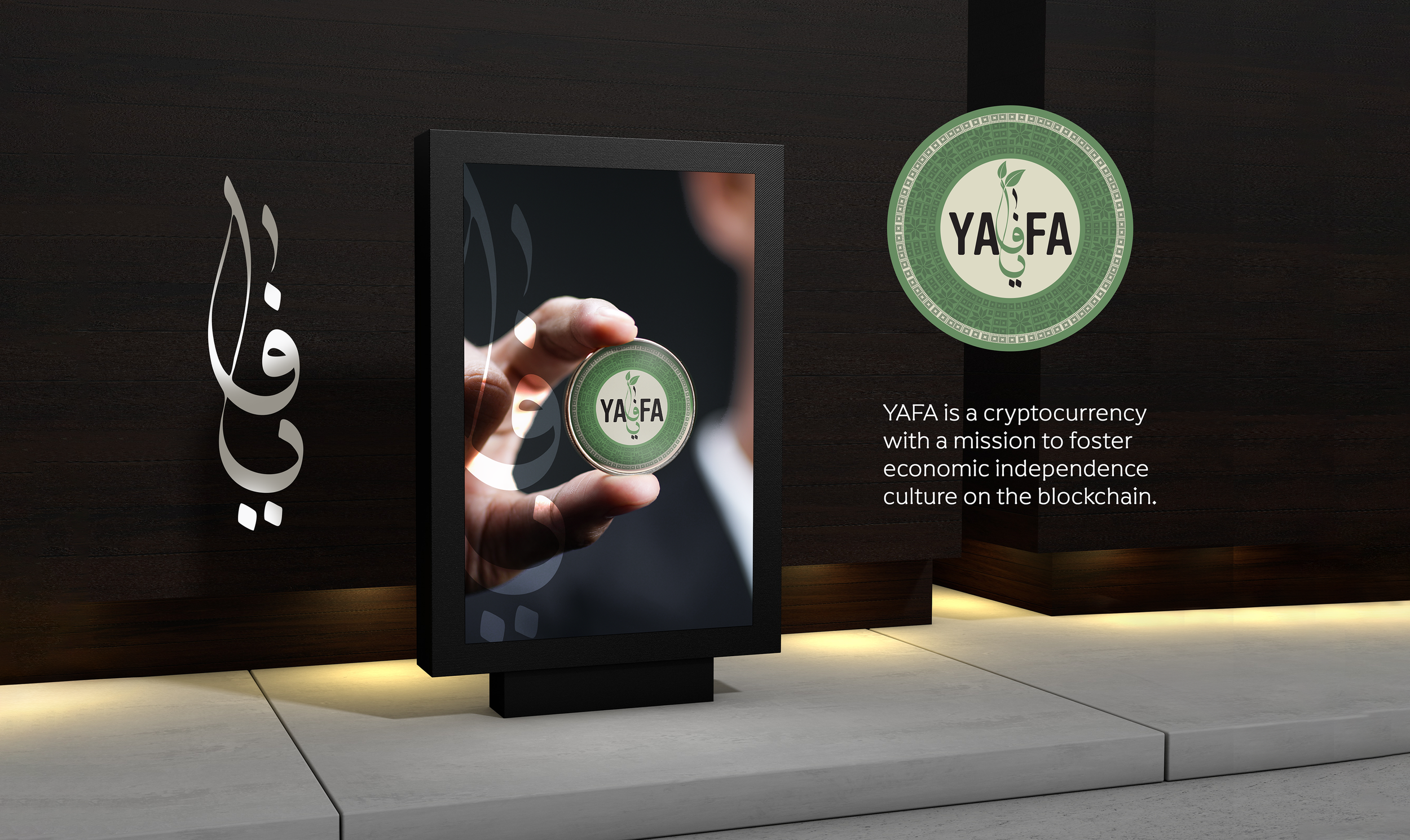
YAFA — a digital brand with roots and reach.
YAFA needed an identity born for screens: fluid, system-driven and unmistakably its own — yet carrying a cultural memory that set it apart from the flat sameness of the tech category.
The challenge
YAFA was launching into a sea of interchangeable tech brands — the same geometric sans-serifs, the same gradients, the same weightless minimalism. Standing out meant resisting the defaults without sacrificing the clarity a digital product demands.
The brand also had to live first and foremost on screens, across light and dark interfaces, app icons, loading states and motion — places where a static logo isn't enough. It needed a flexible identity system, not just a mark.
And it wanted a point of cultural difference — a quiet signal of where it came from — without becoming a costume.
The approach
We built YAFA as a living system rather than a fixed logo. A modular core mark flexes between an icon, a wordmark and an animated state, so the brand can adapt to any digital surface while staying recognisably itself.
The cultural layer is structural, not decorative: proportion, rhythm and geometric logic drawn from heritage pattern, abstracted into something that feels native to product design. A spectrum accent gives the brand energy and a clear hierarchy across light and dark UI.
We defined the brand directly in the medium it lives in — designing real interface components, motion and states, not just print sheets.
The delivery
We handed over a digital-first brand system ready to drop straight into product and marketing.
- Identity systemModular mark, icon and animated states.
- UI foundationsColor, type and component styling for product.
- Motion languageLogo build, transitions and micro-interactions.
- ThemingCoherent light and dark mode behaviour.
- Brand guidelinesDigital-first rules and usage examples.
- Launch kitSocial templates, app store and web assets.
Inside the system

A brand that behaves, not just sits.
"It looks like a product, not a poster — exactly what we needed."— YAFA product team