Al Areen — an identity built to ascend.
A martial arts and human development academy in Dubai needed more than a logo. We built the “Ha An Tha” mark — Arabic calligraphy shaped into a symbol of ascent — and a lion that stands for honour. Seven years on, it is the academy’s most recognized asset.
The challenge
Al Areen teaches Muay Thai, Strength and Filipino Martial Arts — but at its heart it is a human development institution. The identity had to carry that depth: recognizable at ringside, dignified on a certificate, and meaningful to students who wear it as a promise, not a print.
It also had to live across three cultures — Arabic, English and Thai — without imitation or novelty, and endure for decades in a market where gym brands are disposable.
The approach
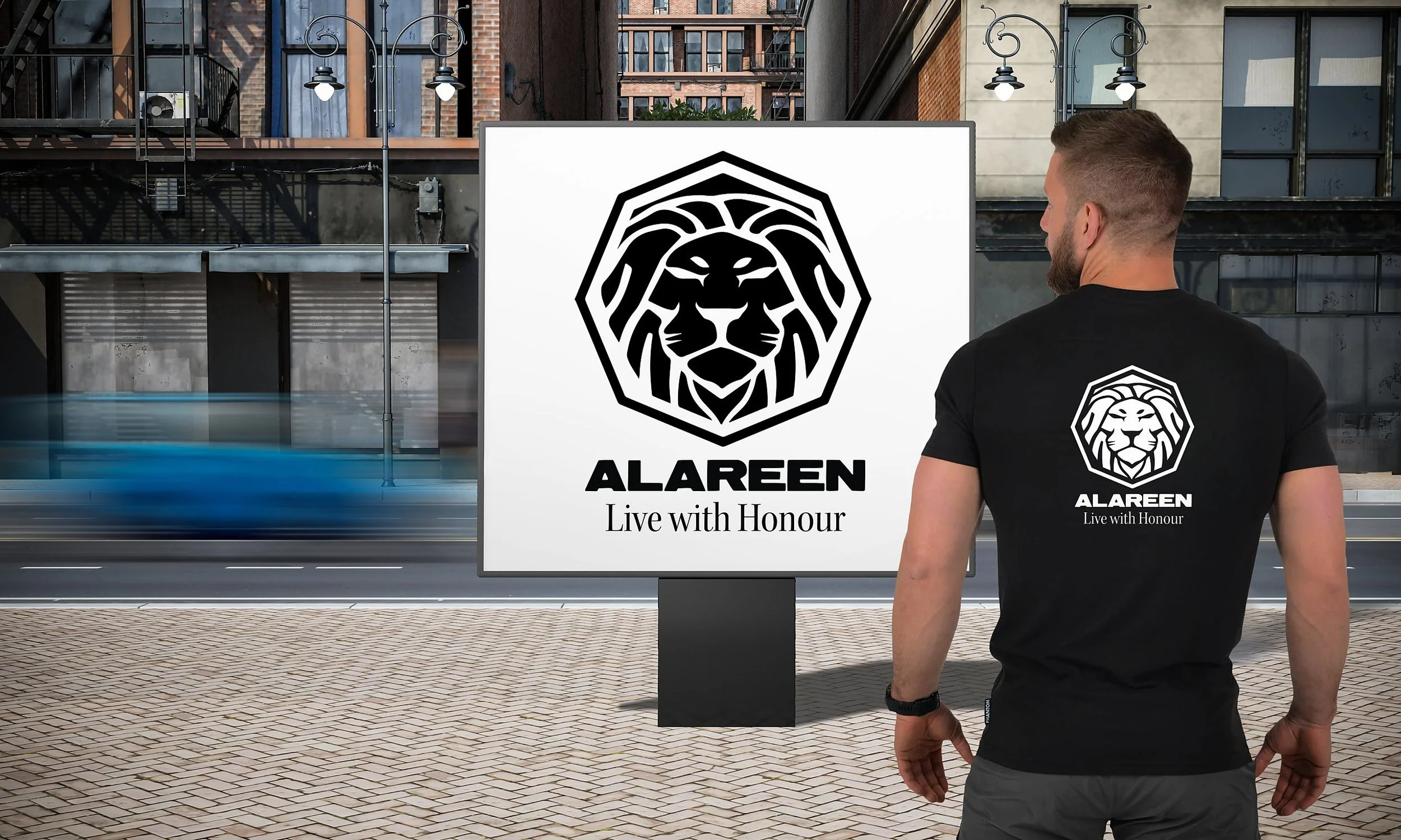
We began with Arabic calligraphy — the letters Ha, An and Tha — and shaped them into a single motion of ascent: climbing the ladder, elevating oneself. You read the symbolism first, and discover the calligraphy beneath. The lion mark, crowned by the words Live with Honour, gives the community a standard to carry.
This is design as brand architecture: systems, proportion, rhythm and permanence — an identity engineered to absorb new programs, events and languages without losing itself.
A brand that kept living
Fourteen years into the academy’s journey — seven under this identity — the marks have become part of how Al Areen is recognized in Dubai and beyond. Students in Jordan and Syria know it. A martial arts school in Kuwait asked permission to wear it. The work outlived every circumstance that created it.
Today Rissala Design is invited back to shape the academy’s next decade: a full visual language where Arabic, English and Thai coexist with dignity — from apparel and events to signage and, one day, a building of its own.
An identity that became an institution.
“I don’t see you as a graphic designer. I see you as an architect who thinks in systems, proportion, rhythm and permanence.”— Wael Al Sayegh, Founder, Al Areen