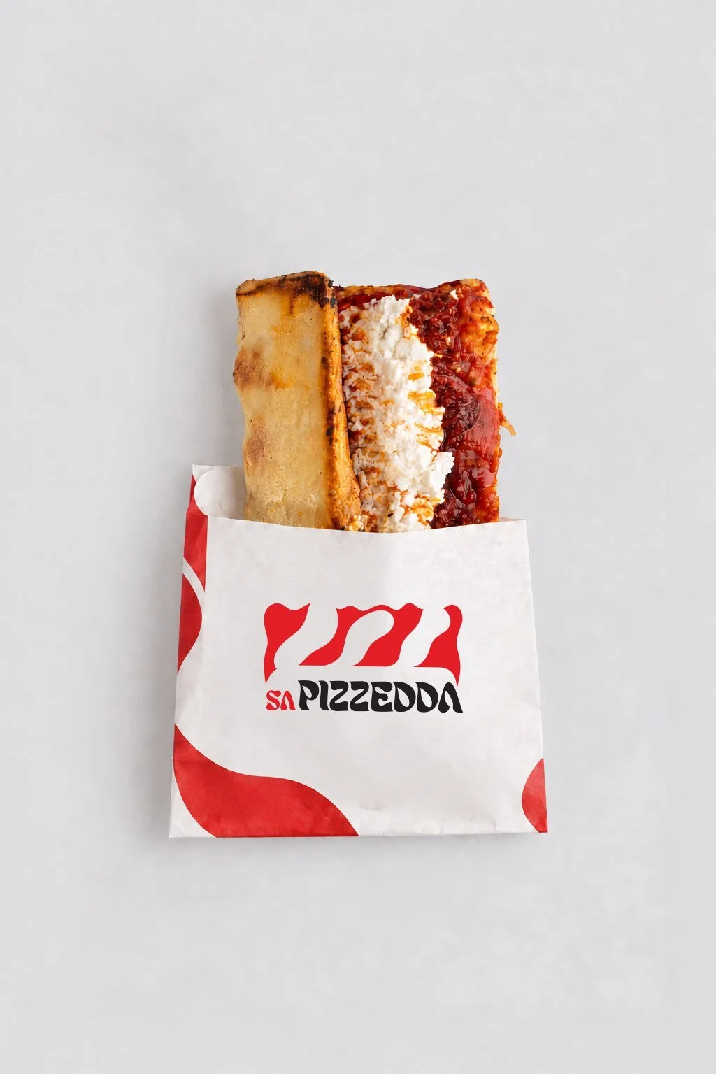
Food identity and application concepts
Sa Pizzedda
Cagliari roots meet Milan energy in a visual identity inspired by the half-folded slice.
The idea
A bold red symbol and custom wordmark turn the fold into a recognizable graphic language. Horizontal, vertical and compact signatures adapt the same idea across formats.
Applications
- Packaging-sleeve concept
- Storefront-signage concept
- Selected digital and campaign concepts