A forum where design had to keep every party at the table.
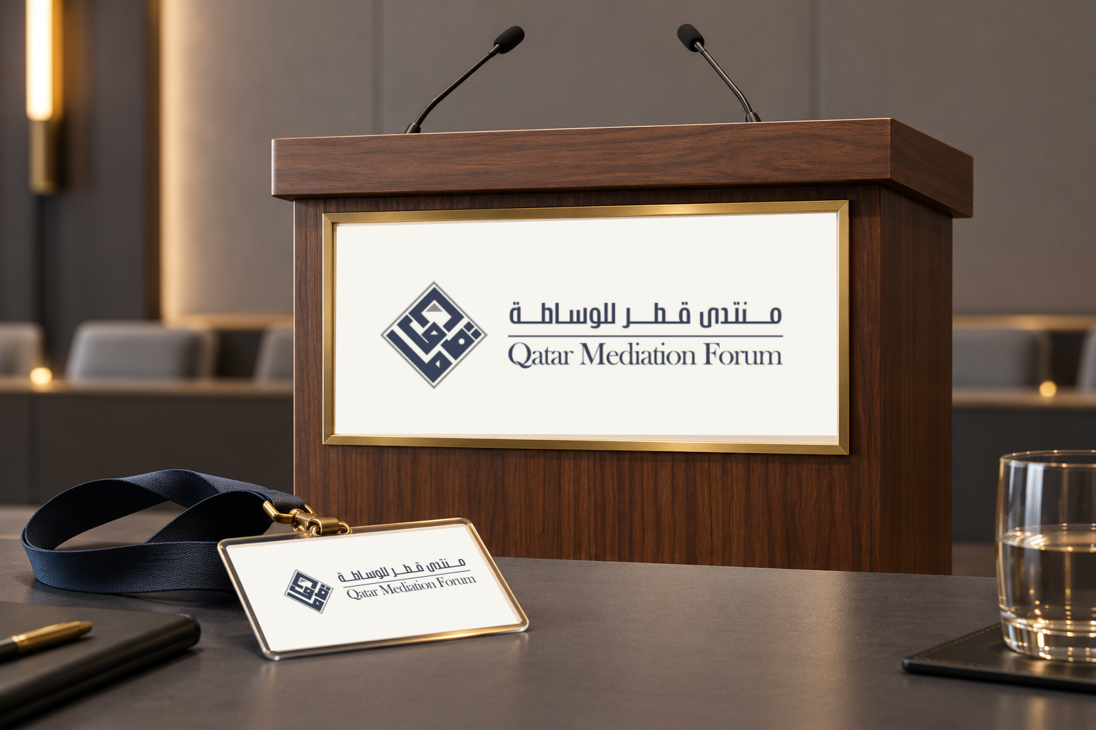
A bilingual identity for Qatar Mediation Forum brings Arabic and English into one measured signature. The original mark and documented stage presentation establish the visual direction; new podium and badge concepts explore how that identity can extend across event materials.
The challenge
The identity brings Arabic and English into a shared visual structure. Geometric Arabic lettering forms a compact diamond, while the two names are connected through alignment, spacing and a disciplined palette.
The original presentation shows this signature at event scale. The design studies on this page extend the same visual language to a smaller set of proposed materials.
The approach
We designed restraint. A measured typographic system rooted in the proportions of Arabic calligraphy, a disciplined palette, and bilingual layouts where neither language leads and neither follows, each set with equal weight and care.
The original stage presentation demonstrates the identity at event scale. New podium and badge studies explore further applications of the same signature.
The delivery
The source presentation includes the bilingual identity and event-stage graphics. The concept studies shown here extend that visual language to a podium and delegate badge, clearly distinguished from the documented event presentation.
Authority, without a raised voice.
One signature, from podium to badge
The original bilingual signature is applied to walnut, a restrained brass edge and warm ivory. This podium and delegate-badge visualization explores the identity at two scales; it is not a record of produced event materials.