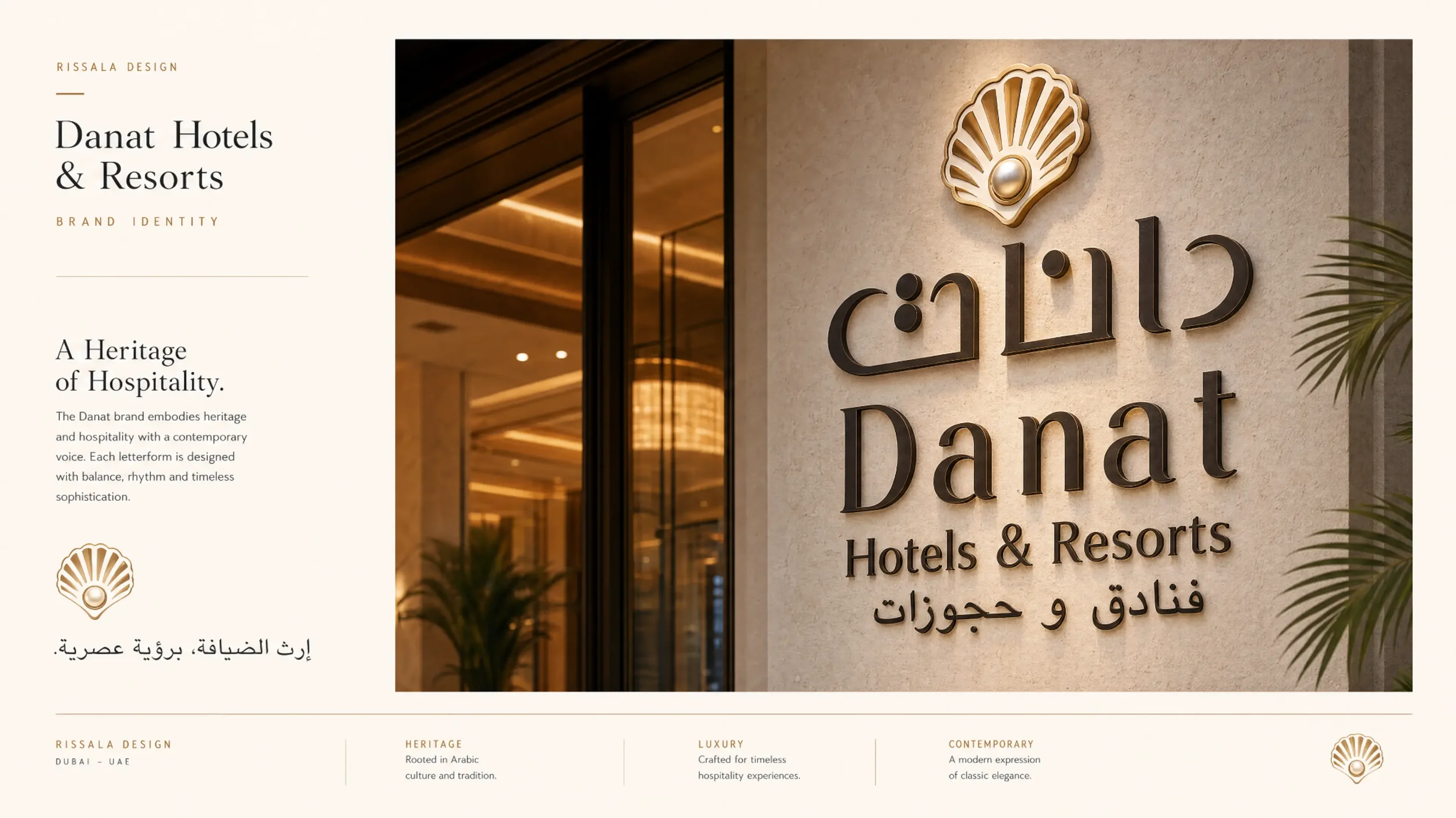
Danat — a luxury brand, given its Arabic voice.
When an international branding agency shaped the Danat hospitality brand for the UAE, the Arabic identity needed to be more than a translation. Rissala Design created the Arabic wordmark and typographic language — luxury that reads native.
The challenge
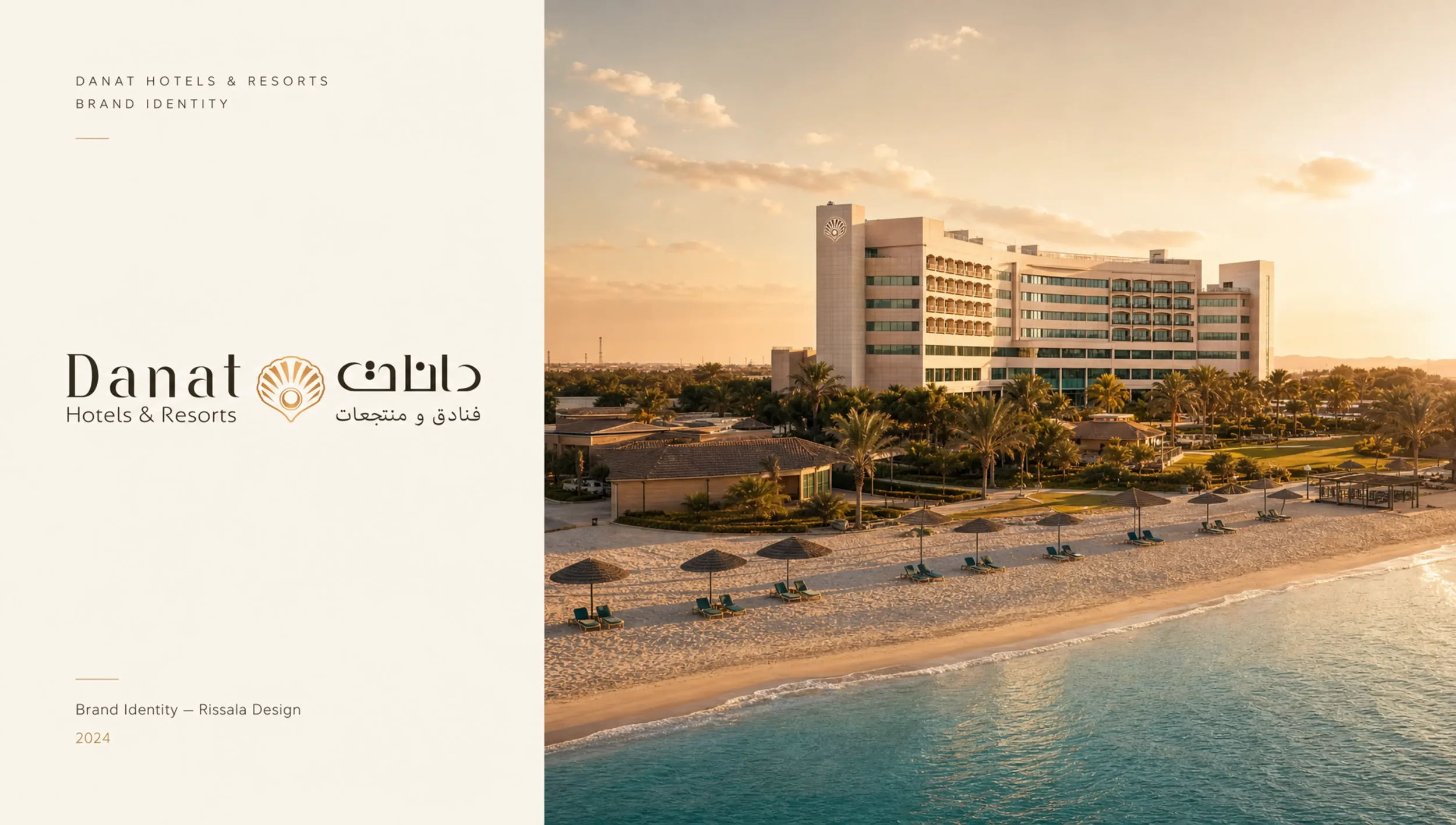
Global agencies design world-class Latin identities — and then the Arabic version is too often an afterthought: mechanically matched, culturally flat, visibly secondary on the façade of a luxury property.
Danat — “pearls” in Arabic — deserved an Arabic identity with the same craft as its Latin counterpart: equal presence on signage, equal elegance at every touchpoint, and letterforms that belong to the Gulf rather than borrow from it.

The approach
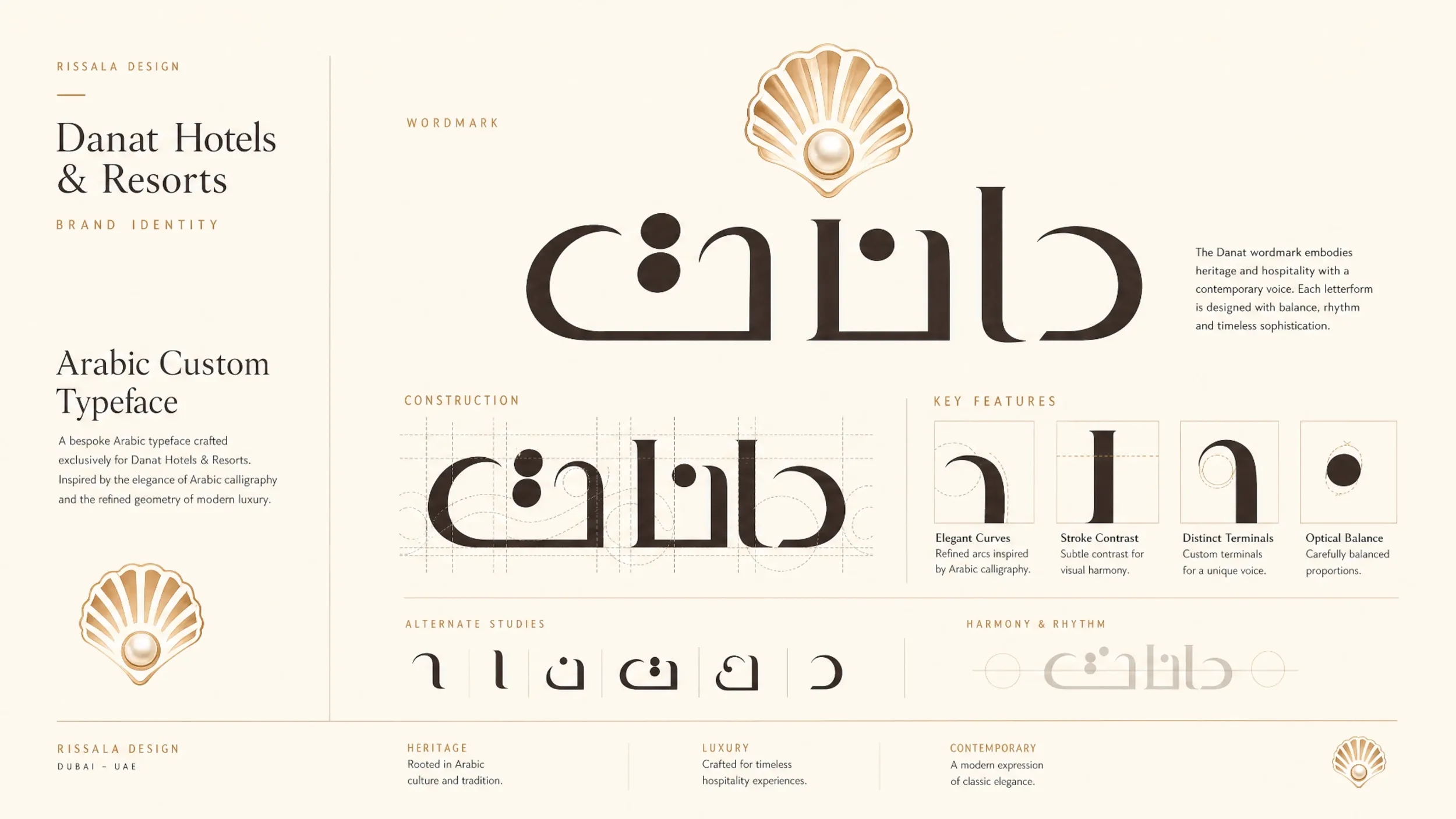
Working alongside the international brand team, we drew the Arabic wordmark and typographic language from the source: the rhythm and proportion of Arabic calligraphy, disciplined into a contemporary luxury voice that sits in perfect optical balance with the Latin identity.
Weight, contrast and spacing were tuned letter by letter so that bilingual lockups, signage and print read as one brand — not a brand and its translation.

Why it matters
Arabization is where Rissala Design lives: bicultural, bilingual, and fluent in both the craft heritage of Arabic script and the systems discipline of international branding. For Arab organizations in America — and global brands entering Arab markets — this is the difference between being translated and being understood.